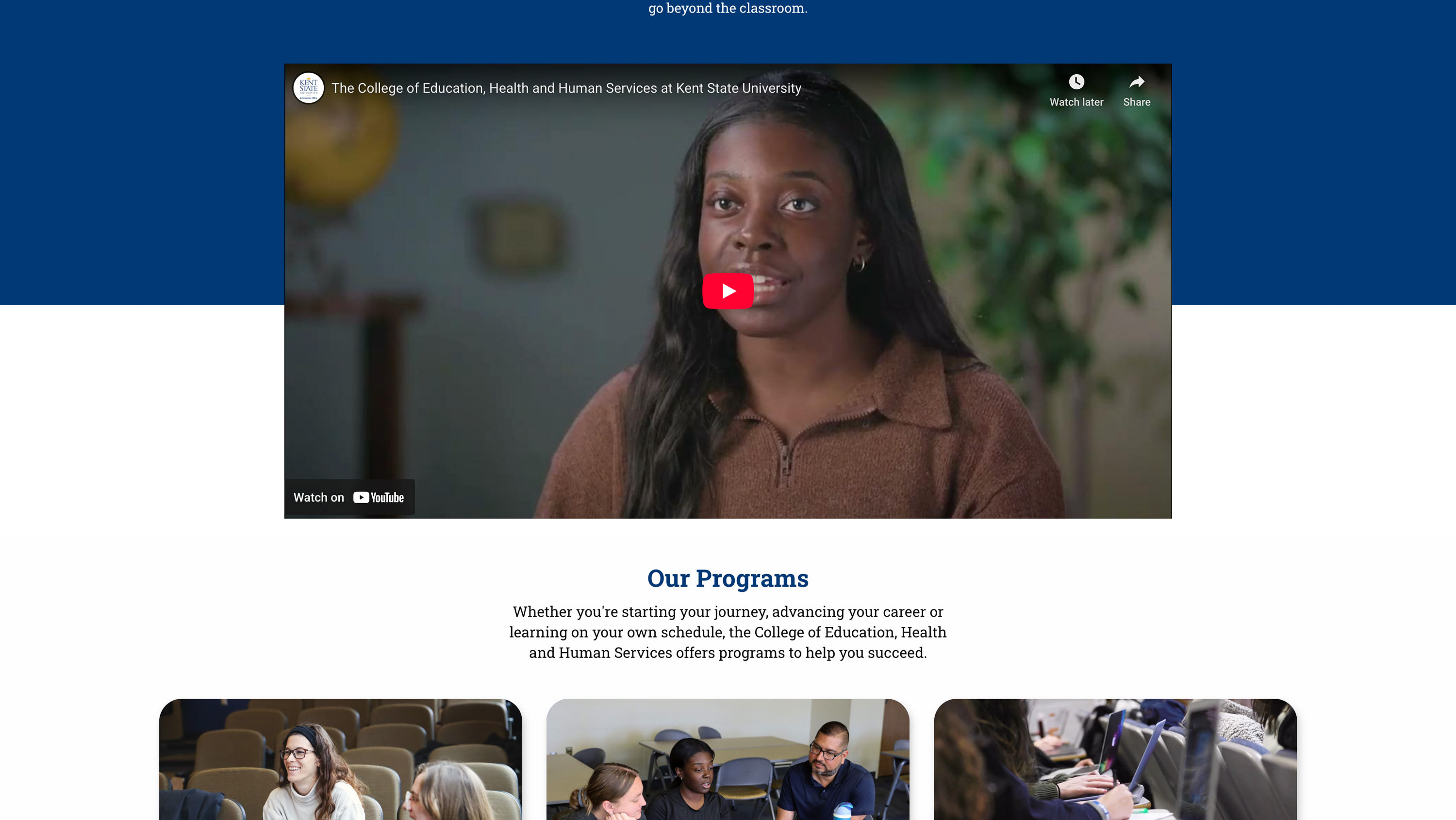
Instructional resource center and learning innovations lab
Role: Graphic Designer/Communications Strategist
Deliverables: Two Informational Brochures
Objective: To create distinct visual identities and clear messaging for two essential hubs within Kent State's College of Education, Health and Human Services (EHHS).
Deliverables: Two Informational Brochures
Objective: To create distinct visual identities and clear messaging for two essential hubs within Kent State's College of Education, Health and Human Services (EHHS).
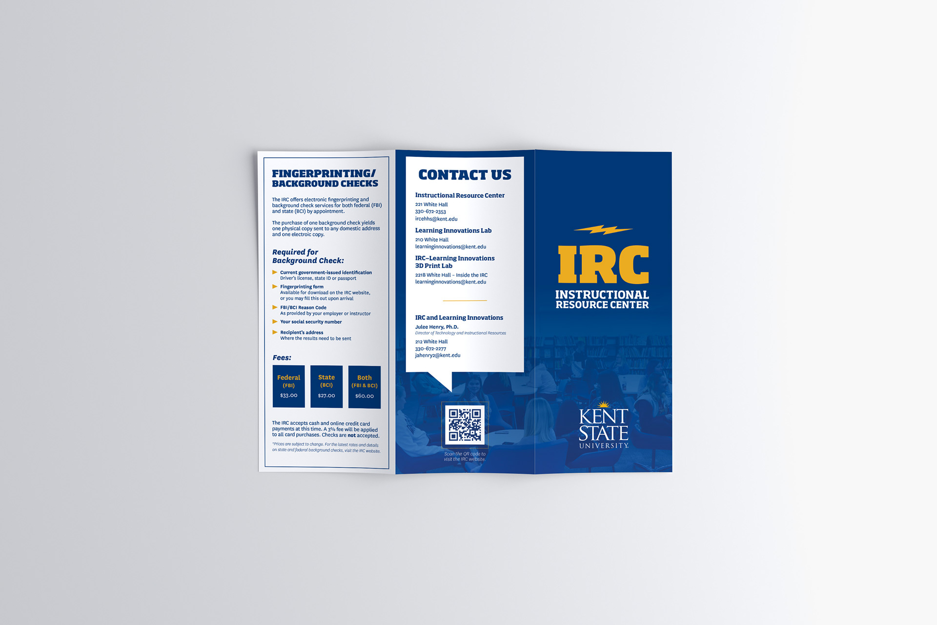
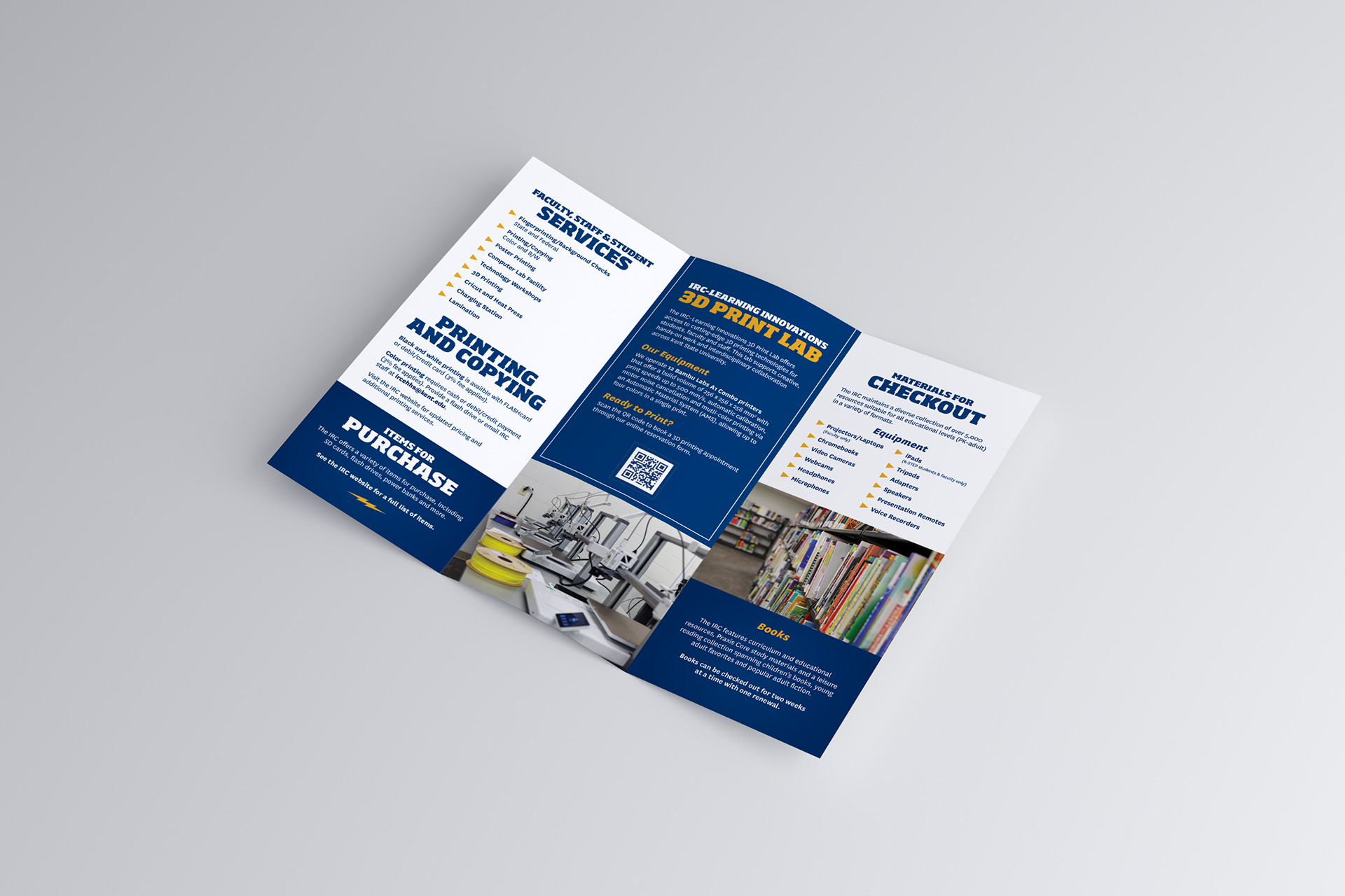
The Purpose: The IRC is the heart of operations for EHHS students and faculty. The brochure needed to communicate support and utility. It serves as a practical guide for users who need immediate academic resources.
Key Messaging Points:
• Essential Services: Highlighting "bread-and-butter" needs like printing (large format, color), laminating and binding.
• Resource Library: Showcasing the extensive collection of textbooks, test kits (OAE/Praxis), and equipment available for checkout.
• Professional Preparation: Emphasizing specialized services like student-teacher fingerprinting and background checks.
• Tone: Helpful, reliable, and organized.
• Resource Library: Showcasing the extensive collection of textbooks, test kits (OAE/Praxis), and equipment available for checkout.
• Professional Preparation: Emphasizing specialized services like student-teacher fingerprinting and background checks.
• Tone: Helpful, reliable, and organized.
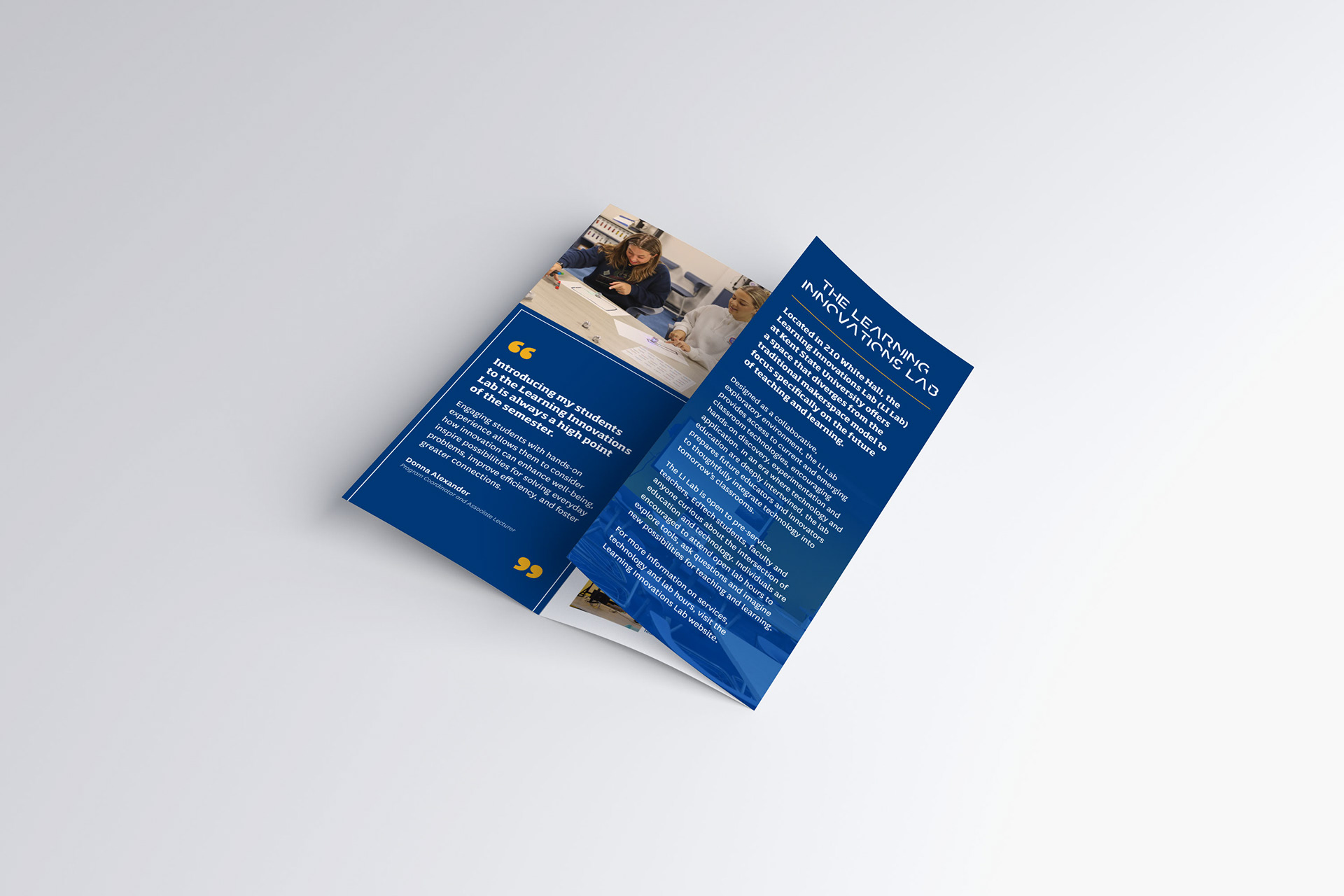
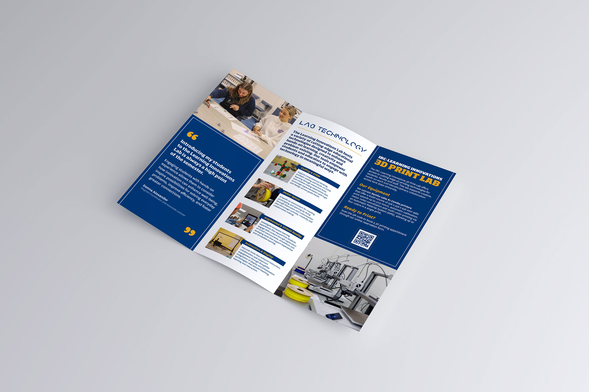
The Purpose: The Learning Innovations Lab is a Design Innovation Node—a forward-thinking makerspace. Unlike the IRC's focus on current academic needs, the LI Lab brochure focuses on exploration, emerging technology, and the future of pedagogy.
Key Messaging Points:
• Hands-on Tech: Introducing users to cutting-edge tools like 3D printers, VR/AR, robotics, and more.
• Pedagogical Innovation: Encouraging pre-service teachers and health professionals to experiment with how these technologies can be integrated into future classrooms or clinical settings.
• Interdisciplinary Collaboration: Positioning the lab as a space for all majors to solve real-world problems through design thinking.
• Tone: Inspiring, modern, and high-energy.
________________________________________________________
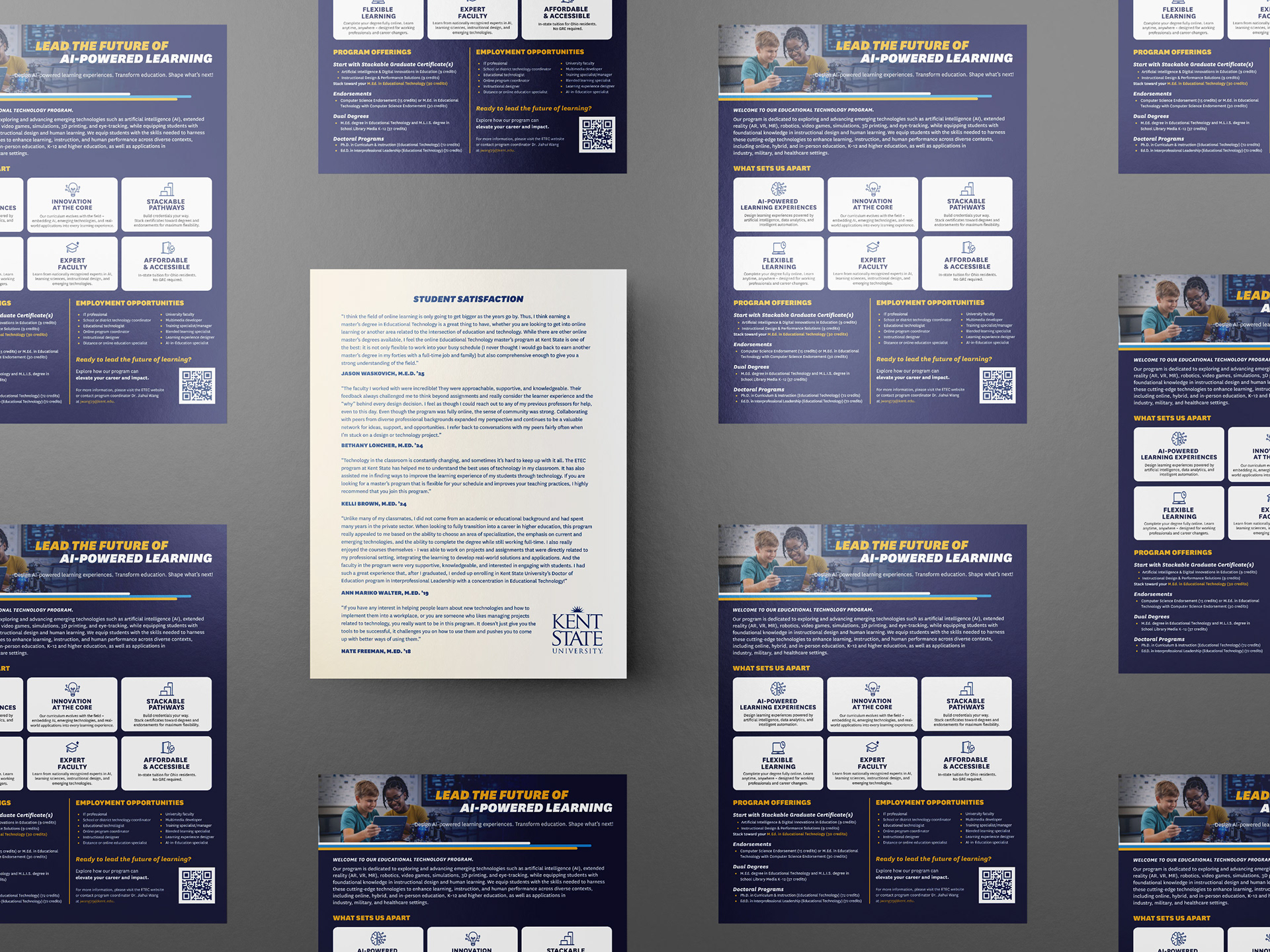
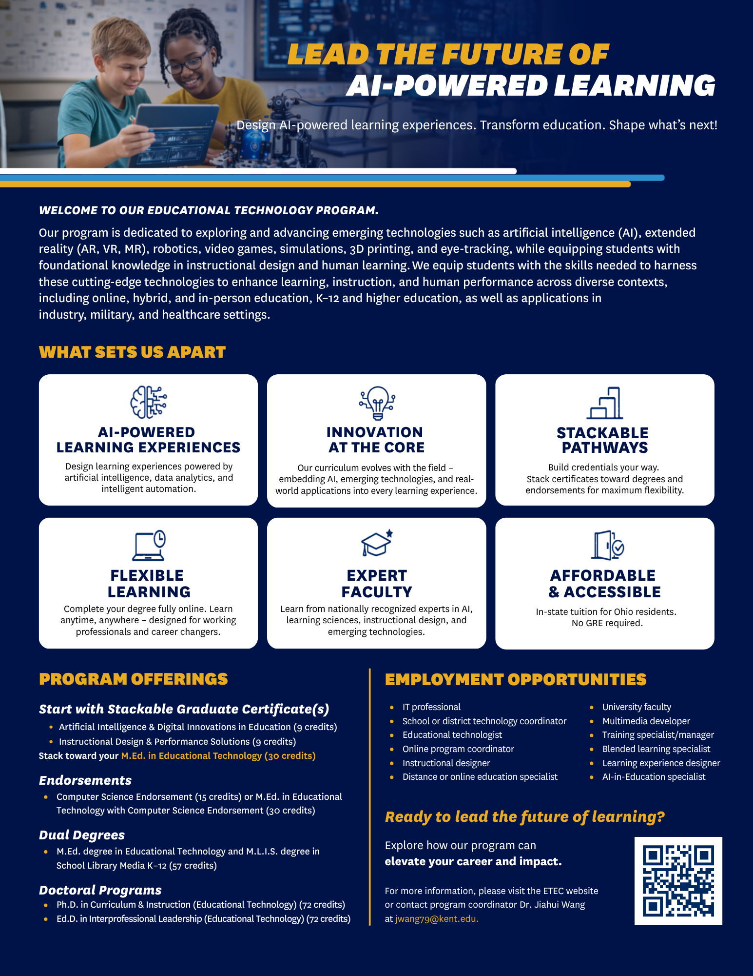
Educational Technology Information Sheet
Deliverable: Double-sided Program Information Sheet
Objective: To create a high-impact recruitment tool for the Educational Technology program that simplifies the path from certificate to doctoral degree while highlighting student success.
Objective: To create a high-impact recruitment tool for the Educational Technology program that simplifies the path from certificate to doctoral degree while highlighting student success.
The Design Challenge
The ETEC program offers a wide range of stackable credentials, endorsements, and degrees. The primary challenge was to take a massive amount of technical academic information and organize it into a visual hierarchy that doesn't overwhelm prospective students.
Strategy Summary
I utilized custom icons for "What Sets Us Apart" to allow for quick scanning of key benefits and simplified the "Employment Opportunities" list into two columns to showcase the versatility of the degree across IT, school districts, and the private sector. The outcome was a professional, dual-purpose marketing piece used for both physical recruitment fairs and digital downloads.
________________________________________________________
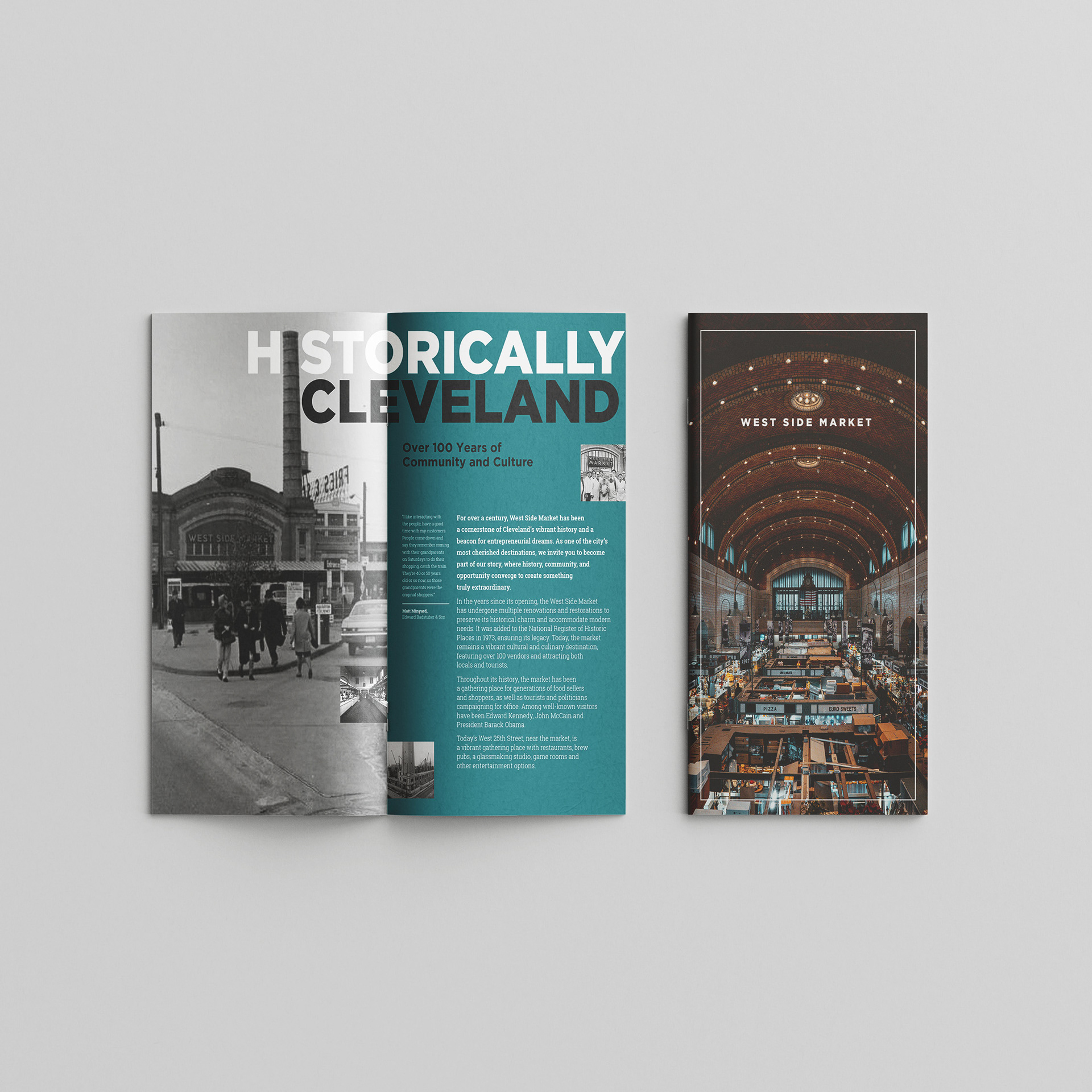
West Side Market Pamphlet
The Challenge: Design a promotional mailing piece for a Northeast Ohio farmers market that communicates its unique identity while adhering to complex typographic systems.
The Solution: I chose the West Side Market in Cleveland, focusing on its dual identity as a historic landmark and thriving community hub. By utilizing a bold, structured typographic system and high-contrast color palettes, I created a narrative that honors the market's 100-year legacy while appealing to a contemporary audience.
Typographic Hierarchy & System: I selected a heavy, condensed sans-serif for the primary headers to mirror the West Side Market's iconic vaulted ceilings and brickwork. The "Hero" type acts as a structural anchor, providing a sense of permanence and scale.
Visual Storytelling: Color is used as a navigational tool. The transition from a cool teal (representing historical reflection) to a warm, energetic orange (representing the literal heat and activity of the food stalls) guides the reader's emotional journey through the piece. By bleeding the photography off the edges and overlaying type directly onto the images, I broke the "box" of traditional brochure, creating a more immersive, magazine-like experience for the viewer.
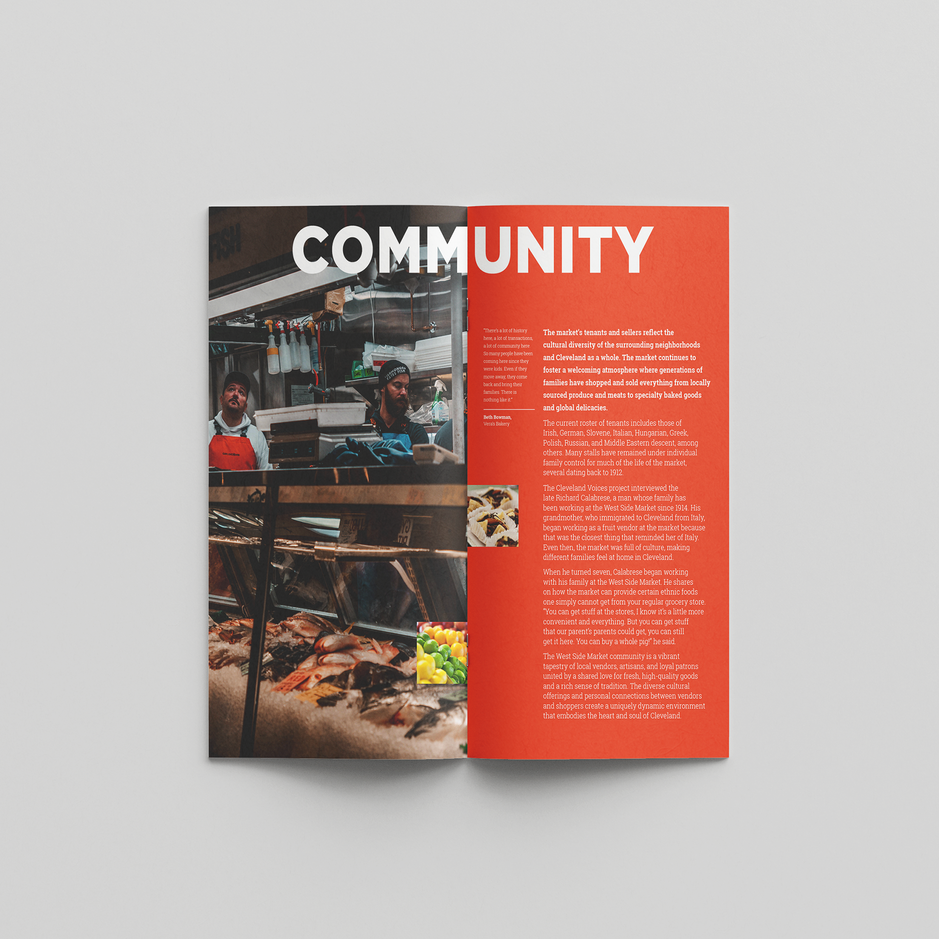
Narrative Context: Rather than focusing solely on the architecture, the "Community" spread prioritizes environmental portraiture. This puts the focus on the multi-generational vendors, transforming the market from a "building" into a vibrant tapestry of human stories.
I used a system of secondary call-outs and captions to allow for skimming. A reader can understand the essence of the market through the large-scale pull quotes alone, or dive deeper into the body text for the full historical context.
The design functions as both an educational tool and a marketing piece. By highlighting the cultural diversity of the vendors, the brochure serves as an invitation to a wider audience to participate in the market's ongoing history.
Tools & Skills
• Layout: Adobe InDesign
• Image Processing: Adobe Photoshop
• Systems: Grid-based design, typographic hierarchy, information architecture
• Image Processing: Adobe Photoshop
• Systems: Grid-based design, typographic hierarchy, information architecture
________________________________________________________
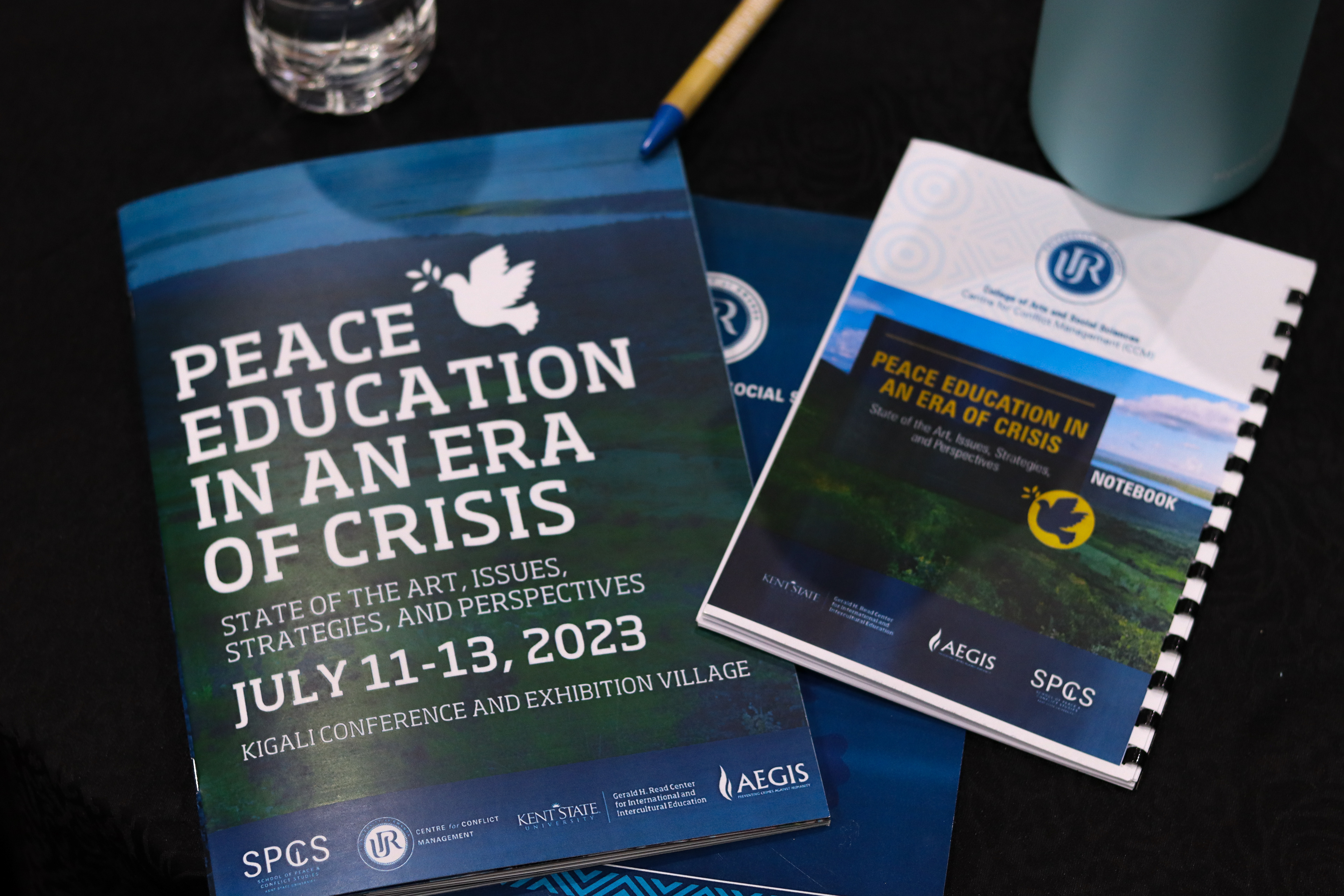
PEACE EDUCATION IN AN ERA OF CRISIS
Themes: Peace, education, natural, academic
Bringing together educators, academics, policy makers and civil society, to examine the principles, theories, praxis, and potential of contemporary peace education around the world.
Delegates attending Peace Education in an Era of Crisis spent three days learning from each other and the Rwandan people's example on how to create lasting peace.
The conference, which took place July 11-13 in Kigali, Rwanda, was sponsored by Kent State University’s School of Peace and Conflict Studies, Kent State’s Gerald H. Read Center for International and Intercultural Education, the University of Rwanda’s Centre for Conflict Management, and the Aegis Trust, a nonprofit organization dedicated to ending genocide and other atrocities in the world.
Being tasked with designing the branding, marketing materials, and social media presence for this event was rewarding and challenging. My goal was to differentiate the conference from standard Kent State branding while respecting the topic of conversation: ending genocide and promoting peace worldwide.
Kigali, Rwanda was chosen as the location for the conference to make it more available to those from Africa, to expand Kent State’s growing relationship with the University of Rwanda, and to allow attendees to learn about the peace-building work of the Rwandan people following the 1994 genocide.
The starting point of my designs was Rwanda's lush, rolling hills. I incorporated the natural colors of the landscape in print and digital materials, leaning on dusty blues and olive greens.
I was able to work closely with Amanda Johnson, Ph.D., director of the Gerald H. Read Center for International and Intercultural Education at Kent State University, R. Neil Cooper, Ph.D., professor and director of the School of Peace and Conflict Studies at Kent State University, and Aggée Shyaka Mugabe, Director of the Centre for Conflict Management at The University of Rwanda. Through their guidance and critique, I developed materials that best served the mission and vision of the conference.
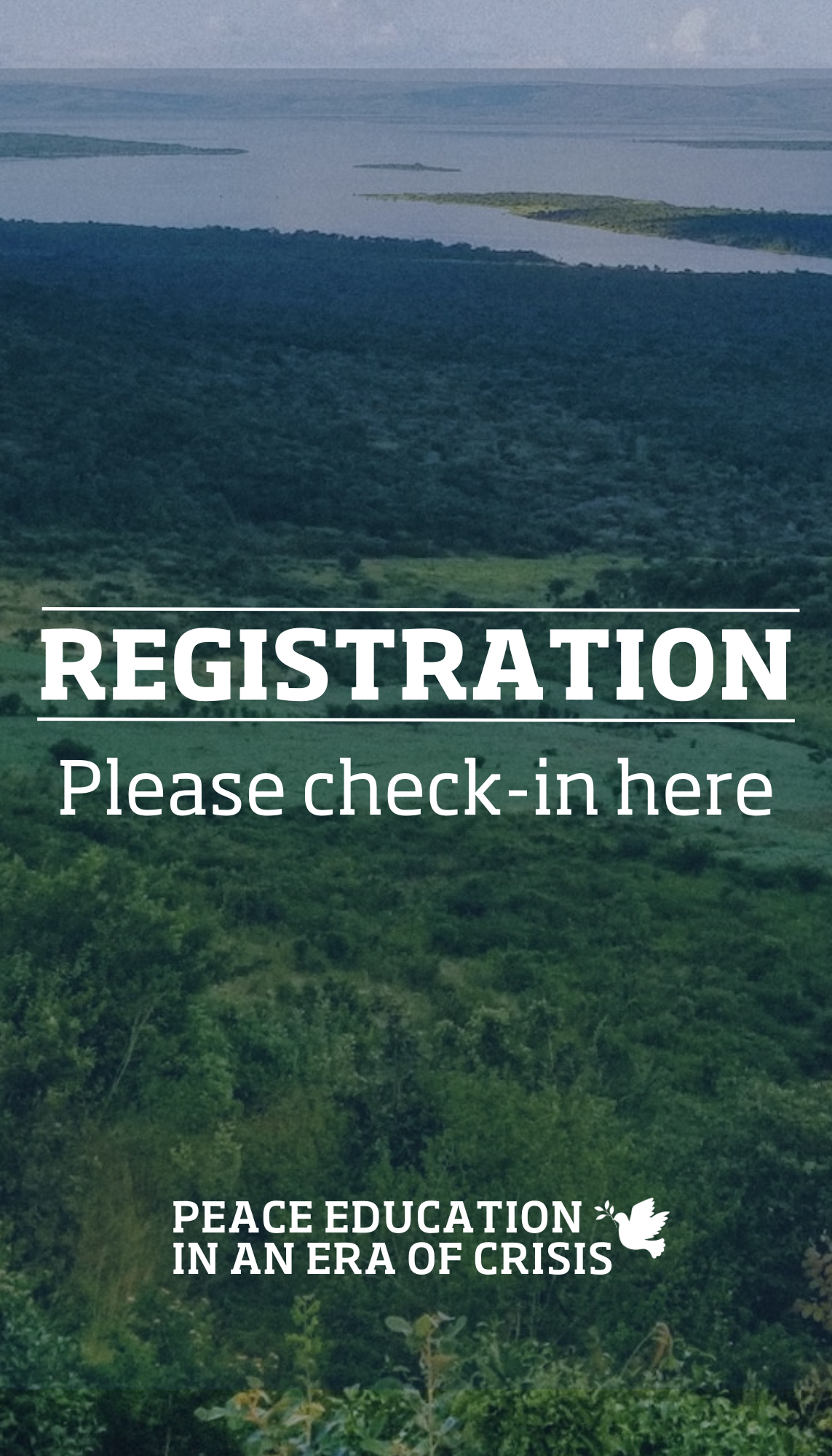
Registration Sign (14x17in)
Canva
Canva
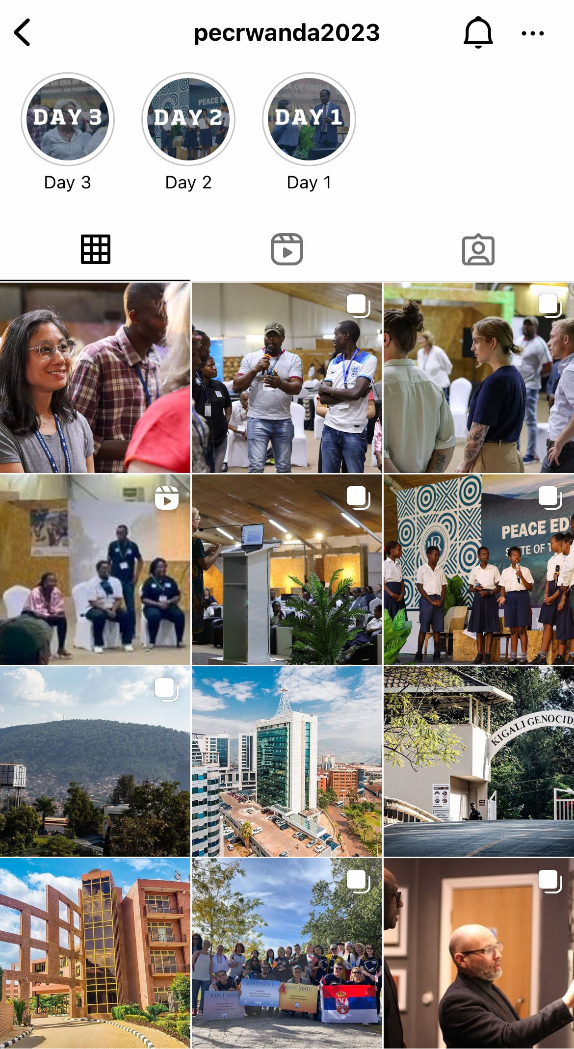
PECR2023 Instagram feed